
Project Brief-
For this unit there is not a scenario I have to follow, it is more open, it has told me to investigate and discuss various research methods that will help me later on in the game design occupation. This will also help me to research in later units and projects. Using these research methods I have been asked to create either a game or film poster, the genre and theme being my choice.
Tasks(overview)
Task 1
- Compare the effectiveness of Primary and Secondary Resources.
- Define given terms.
- Define given terms and research tools.
- Compare the effectiveness of these terms and tools.
Task 2
- Produce primary and secondary research.
- 20-30 Rough designs.
- 2 very developed designs-Including a rationale (100 words minimum).
- Final design.
- Final design discussion.
Task 3
- Final evaluation.
More in depth explanation:


TASK 1
Primary And Secondary Resources.
PRIMARY RESOURCES- Primary Resources are first-hand original resources, it’s research you collect on your own. It has more of a personal touch and is more relevant at the time. Primary Resources include; Photographs, diaries, letters, recordings, interviews and many more.
SECONDARY RESOURCES- Secondary Resources are a very common source of research, many people use this method rather than primary because; It’s quick, costs low (or costs nothing), It’s much different compared to Primary, it has less ‘freshness’ and it doesn’t feel original. It gives a view to more than one opinion (not you own) which is good for politics etc…
How Effective Is This Research?
PRIMARY RESEARCH-When you gather research first-hand it will be accurate and easier to understand as you’ve collected it. It also gives you more control to how you go about gathering your research, and how you will use it later on. Owning the research can also give an upper hand over competitors if needed.
SECONDARY RESEARCH- As it already exists it wont take as much time to collect, compared to primary research. As you get it off the internet and other media platforms somethings maybe false or need slight tweaking to make them correct. so when collecting secondary data you would need to be careful that it actually makes sense.
Defining Key Terms.

Methods & Tools For Generating Research
Interview-
An interview is a Q&A, normally the word refers to a one-on-one conversation, one person being the interviewer and the other being a interviewee.
Focus Groups-
Gathering information on deliberately selected people (normally a small group) those people are usually asked about their; perceptions, opinions, beliefs and attitudes towards a product. These people can express freely in a group their opinion, during this time, the researcher either takes notes of records it.
Surveys-
Surveys can be online or on paper. You usually get a set of questions and have to answer them. This information tends to get used in business, mainly for finding out targeted audience. They are normally anonymous therefore people can be 100% honest with answering.
Observations-
Observation research, in which the researcher observes ongoing behavior. This will help the researcher know more about how to be patient as many people can become impatient with such tedious tasks.
Books-
Books are knowledge. The readers of books can obtain information from certain books by reading them. It might be the easiest way of researching as books are not only in library’s which are mostly free, you can get books on the internet and on your phones (which tends to cost). you can read them whenever, where ever you want.
Journals-
Journals are usually events, information and thoughts written by one person writing about their experiences. They tend to be more personal and detailed. Journals from the past are shown as apart of history, they give a good understanding of buildings, people, etc, from the past.
Internet-
Internet is one of the easiest, quickest tools in the world to obtain knowledge. We can expand our knowledge with just a couple of clicks. We can find anything on the internet, ranging from A to Z. The world is filed with knowledge, the internet is just a way to share it with the word.
Magazines-
Magazines contain articles, pictures and are perfect for when you need inspiration. They don’t tend to talk about serious political issues, they leave that to the newspapers. If they ever do touch on any celebrities they tend to sugarcoat it slightly.
Visits-
Visiting areas of interest allows researchers to obtain knowledge they might not have picked up on if only, they looked at a photo or read about it. Being physically in front of something is a great way to learn.
Wikia-
It’s a website that contains thousands of fandoms where fans can share and inspire other people with their ideas, opinions, photos, about different TV shows, bands, games, etc.
Hearsay-
It’s a piece of evidence given which is out of court to prove the truth. (E.G. witnesses to a crime).
Rumor–
Information passed around that may or may not be true, it can cause a lot of drama. Most people believe the ones who spread rumors tend to be women, stereo-typically. People have a choice whether to agree or disagree with rumors, whether they are true or not. This can change their viewpoints on the subject or celebrity.
Effectiveness Of These Methods
These methods are useful, everyone has their own preferences for their research methods, I find some easier to use then others. The ones I use are:
Internet-
The internet is made up of networks, which contain opinions, conversations and ideas. It is good for sharing stuff all over the world, however it’s called ‘The Web’ for a reason, nothing gets out once it gets uploaded. Personally, using the internet is the easiest way of getting research. As it doesn’t require leaving the house, it seems the best method to use as it’s so quick, however there are some websites which spread false information, which makes the research unreliable.
Books-
Books are everywhere these days, not only are they made from paper, they are on tablets, phones and even computers, this means books are easy to get your hands on and tend to be relatively cheap. I believe the only downfall for books is that they tend to be slightly out dated, however they are great for history research.
Surveys-
Surveys are a great way of getting others outlook on a topic of your choice. The people that answer them has the opportunity to be 100% honest as surveys tend to be anonymous. They are perfect for gathering primary research especially since the questions you choose can be completely original and fit for a certain topic.
TASK 2
Primary Research
I have asked my peers about some poster related questions, I will be using this as my primary research and will be keeping the feedback in mind while creating my designs.


-Using this research, I will keep in mind the feedback I’ve collected.
Secondary Research
For my secondary research I will be analyzing some TV posters that were created to advertise to the public about the certain show. I will pick out the most important parts of the posters (large and small details) to help me with my final poster.
Poster 1-

At first glance I can clearly see the title, Spirited Away, it stands out well, has a and would be easy to read for a far distance. The ‘Miyazaki’s’ dark red color is harder to read against the black background. The main character is the focal point, in which the viewers eyes will be draw to the character instead of the background. The reasoning because of this is simple, obviously the artist wants to put emphasis on the lead character.
The color scheme for the whole poster is white, black and a variety of reds (with orange and purple hues). black might be the dominant color here however the different shades of red are extremely standing out, so it doesn’t look empty and looks very harmonic. The background is much more detailed than the character as there is more shading and color. The background shows clearly, a pathway towards a Japanese styled house, and maybe a shed or a gazebo, both buildings covered in Japanese red lanterns. In the distance towards the ‘gazebo’ there is another character, maybe hinting at a side character.
Poster 2 –
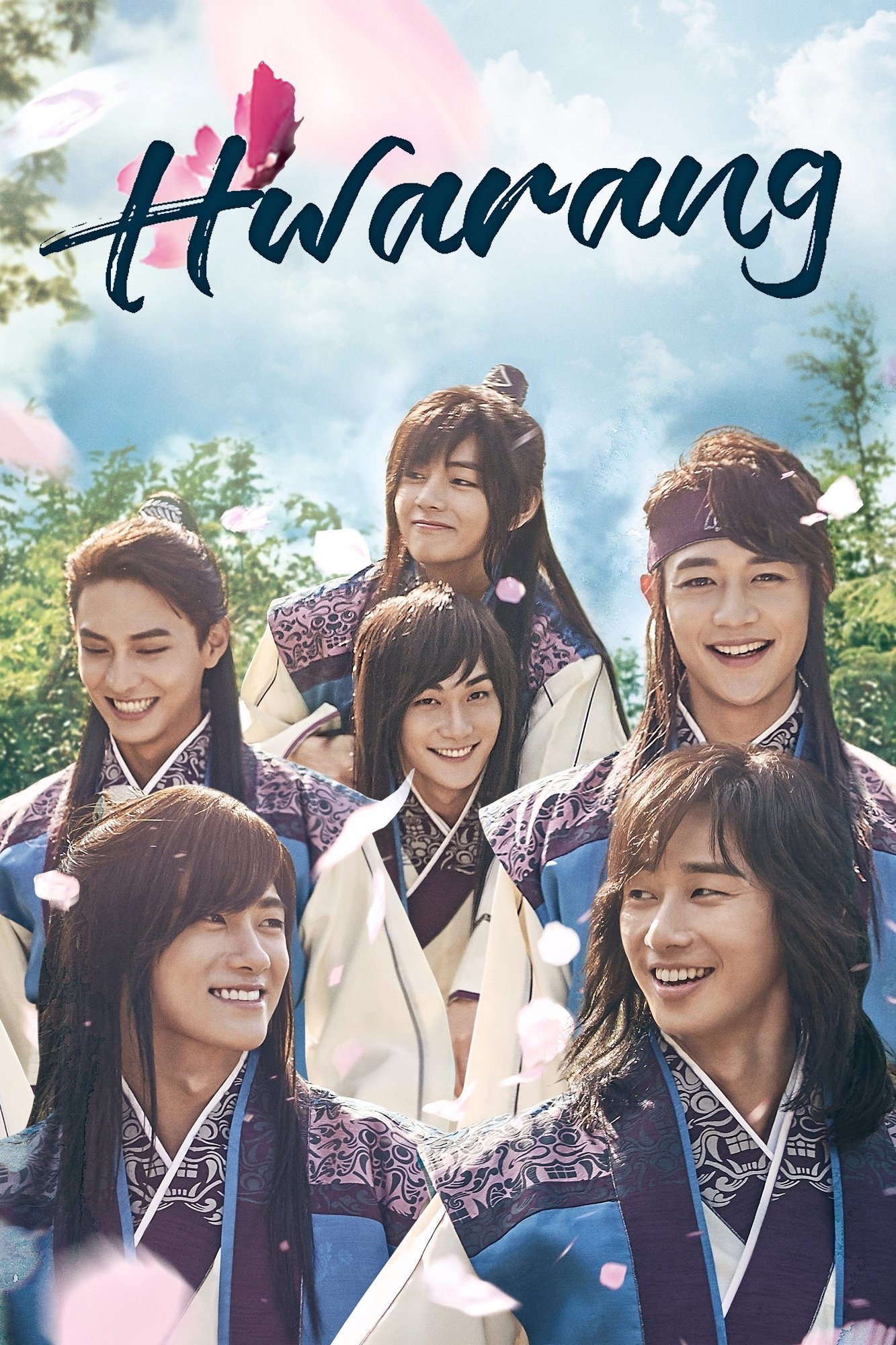
Before I began to look at the poster, I researched up on the name ‘Hwarang’ and found that it means ‘Flowering Knights’ they were a group of elite warriors in Silla, a ancient Korean city. Hwarang were known for their beauty, accessories and makeup. Knowing this now, I have a good understanding of why the characters are ‘glowing’ and wearing extremely flashy clothes (especially since clothes like that were expensive in those times, 57 BC–AD 935). The poster colors are in sync with each other, making it seem very harmonic.
The men wearing the flashy clothes are probably the main characters, for two reasons, one, because of the knowledge we have found out about Hwarang and two, because posters tend to use the main characters on their posters so we, as the viewer can identify them while watching. I tried looking for the exact font however I found that ‘Fonte’ is similar to the font they used:

Poster 3 –

What I notice with first glance is that this poster/show is set in the past (1950’s). It shows the main characters clearly and the side characters slightly faded in the background, this is good as we can become familiar with the character’s faces and know who is the ‘most important’ without even watching the show.
The title uses the same font as the previous seasons, it varies between, ITC WILLOW and The Charles Rennie Mackintosh Font, it is east to distinguish from other fonts and many fans know it as the ‘American Horror Story font’ and actually don’t know the original name. The name of the season, Freak Show, can hint to the viewers it’s set in a circus, but what really reveals it, is the ‘Lead’ female’s dress, the bottom of it is edited to look like the roof of a circus tent.
 (20-30 Rough Designs, I have created 22 in total)
In most of these designs I have included some very odd looking characters, though I might not be using them in the final design I was happy with these rough characters and designs as they all looked very eye catching. Yes, some of them are ‘too full’ and others are ‘too empty’ however I was very pleased, as I had a selection to choose from to develop.

Poster 1

-RATIONALE-
How did I obtain such a design?
I started with the rough design, with a notebook in the bottom left corner of the poster. I began to draw the characters in the notebook, I had made these characters prior to this design, however the odd looking doodles fit well, and they look like they have been drawn by a child who has a lot of imagination. My rough idea for the game behind the poster was:
A young child, was doodling in the pages of her/his math notebook, ignoring the class, soon realizing that her crazy looking doodles have sprung from The Pages and started to speak. Intriguing her to draw more friends for the doodles.
That’s also how I gathered the name. From looking at the poster it might come across as a child friendly (PG) game, from the bright colors and child-like doodles, however once you start playing you will soon realize that this game isn’t suitable for any child.
Poster 2

-RATIONALE-
How did I obtain this design?
The rough design I chose to develop was insanely different compared to this final product, I believe I could have designed this better if I was more experienced in using the products (markers, Pens) I used to color this piece in, I think it ended up this way because I am not familiar with alcohol based markers. The ‘original’ had six balloons and confetti surrounding them. however, as I wanted to go for a ‘creepier’ look, having a full page of colorful balloons doesn’t give off that vibe. We see balloons like this usually with clowns, especially in movies, games and shows. The idea for this poster didn’t really allow me to add in the odd characters I had made before. As I drew the characters as antagonists, for the main player to fight etc. They didn’t work with the theme of Celebration.
I realize the colors are slightly dark so if I choose this as my final design, I would definitely brighten the colors and make it look more child-friendly, however the game behind the poster is definitely not child-friendly.
Final Poster

Final Discussion-
I have chosen the second design, to develop and improve. As I have said before, I wanted to make the design brighter in color and improve the background.
Starting with the background, it took me some time to decide on a color that didn’t clash with the ‘blood red’ balloon and title. I ended up with this dull cyan, at that point I realized that it looked to bare and empty, so I added the confetti I was intending to add in anyway. I still thought the background was missing some extra color so I added some very faded spots of bright color. Happy with the background I went back to the balloon shape and angled it slightly to make it seem as if it was losing air, this gave me the idea that the ‘party’ or ‘celebration’ is almost over. The color of the balloon is the same ‘blood red’ as the title. I have also realized that, obviously without looking at the title, it seems heavily PG, I’m very pleased that I have managed to create it in a style such as that.
Task 3
Evaluation
During this evaluation I will critique my work with my honest opinion, whether it be good or bad.
My Primary research (my survey) could have less vague questions, and more detailed and relevant questions. for example, I didn’t need to know their gender or age. For my secondary research, I should have at least done research on one game, this would have given me a lot of help when whether I do a game poster or film poster. While choosing the posters to research I was definitely biased, 2/3 of those posters are ones I have watched and enjoyed, the other is one I’m very interested in watching. I learned, from my secondary research that the title is the thing that should stand out the most, as well as any main characters. Knowing the information I know from my research, the colors of the poster should be in harmony and in sync with each other, while choosing my colors I kept in mind about this research.
My rough designs quality is exactly as named, they are definitely rough, I hadn’t put much effort into them, my rough designs for this unit were more spaced out, unlike in the previous unit. However when making the two developed designs I did put a lot more effort in, I have noticed after, that they both look scruffy and unprofessional, I should have taken my time to find the suitable color medium.
If I was to redo this unit I would definitely change a few things. The first being the characters, I really intended and wanted to use the characters I created in my final design, however they didn’t fit well with the overall aesthetics. I would have also changed the genre and theme, making it completely full of horror and gore.
My typography was handmade, using a drawing tablet through Photoshop. The style is easily readable and described as ‘bubble writing’. To fit the ‘hidden’ theme (of gore/horror) it was made to look as if it was dripping blood, it fit its purpose as it looks clear and stands out well in front of the background. I was sure to make no spelling mistakes as it would look unprofessional. As I had created it using a drawing tablet, the spacing and alignment might be slightly off, hopefully next time I can overcome this obstacle.
My poster might seem like a child poster, however the audience I aimed it at are teenagers. I expect that teenagers might see this poster among other horror genre posters and get intrigued, and ask themselves ‘why is it so different?’ and get interested that way. The project brief was vague, all it had asked from me was to make a game or film poster using research I had gathered. I’m pretty positive that I stuck to this vague brief and what it had asked from me. The poster is aimed at English speaking people, so the language used is suitable and appropriate as it’s in English. As I have said previously, there might be some misinterpretation when it comes to what age it’s aimed at, as it looks colorful and happy, for this reason I should have added a sub-title to clear things up. I haven’t made any reference to gender or race so I think it is suitable for anyone who is in the age range, no matter what gender or race.
I used Photoshop for my final design because I knew it would look more professional done digitally. The final quality of my design was acceptable, I should have included a sub-title to explain what it was about, however the quality of the final design compared to the developed rough design was much better. I put a lot of effort in keeping my blog professional and I believe it has kept to that standards.
Conclusion-
I’m very pleased with the overall final design, as I have said previously I would have changed multiple things. I would have used characters, changed the genre (theme) and almost definitely added a sub-title to clear up any misinterpretations. I have improved and became more confident with using a drawing tablet. I also have learnt how to research productively to not waste my time. My work on this unit was much different compared to the previous one. My rough designs this unit were more spaced out and I had more room for detail, unlike the previous unit. Mostly all my peers enjoyed the poster and said that I had missed the basic things, such as the sub-title and that it seemed very misleading.
Harvard References
Chiara. (2018). A Viagem de Chihiro. Available: https://www.pinterest.co.uk/pin/439804719855632193/. Last accessed 1st November 2018.
Lulu Chen. (2018). Discover ideas about American Horror Story Freak. Available: https://www.pinterest.com/pin/308707749437412398/. Last accessed 1st November 2018.
The Movie DB. (2016). Hwarang: The Poet Warrior Youth. Available: https://www.themoviedb.org/tv/66496/images/posters. Last accessed 1st November 2018.
Wikipedia. (2018). The Free Encyclopedia. Available: http://www.Wikipedia.org. Last accessed 10th November 2018.
