
UNIT 12- Engaging with an Audience
In this unit we will be working with two other people as a group of three in order to come up with the final posed model which will be designed by us and then modeled in 3ds Max.
According to the project brief, we’ve been assigned a job by Hero forge to produce several posed characters that they can then print off and sell to the miniature painters’ market. They can be created as a human, alien or an animal.
Our character will have to be quite simple and low poly so that the rendering time isn’t too long. Few poses will need to be created, followed by a 360-degree video showing the character off, different materials can be added on top of it if time allows us to do so.
The project brief will explain the content of this unit a little more in depth, followed by Tasks and Criteria table:
PROJECT BRIEF:

TASKS AND CRITERIA: From this task criteria we can sense that there are only 3 tasks which are pretty straight forward. Research, planning and design and lastly evaluation which should be all done by the hand in date. The rough designs can be shared between my two other partners therefore we’ll be left with ten rough designs to do each which is making the whole design job a bit easier as we can share our ideas and pick the best ones and continue to develop them from there.

From the task criteria we know that the first thing to research is Hero Forge, we’ll do so in the next paragraph followed by the rest of the research.
HERO FORGE
Hero Forge (an online company which specialises in a production of customised table top figures) is a creation of Sky Castle Studios, LLC (Limited Liability Company). The customisation allows you to change character’s race, gender, pose, clothing etc. In simple words we get to create a whole character from scratch which makes it a lot more fun than ordering a premade character. These can be used in RPG games like Dungeons and Dragons. The mention of the game over the internet is massive. D&D is a RPG game which is usually played indoors with a group of people. There is a fictional setting and each layer gets to control their character within the setting.
We have an interesting option to create poses, we can pick a pose for our character as well as base and mount. This shows that the company cares for every detail and wants us to get every possible bit of the customisation process.
Other than being able to customize the looks, we can also decide what material we want our special figure to be made out of. We can pick from cheaper options like plastics or go into the better-quality ones like steel and bronze which of course come at a higher price point. The standard price and material are acrylic plastic which would cost you $19.99 USD (£15.94) (starting price). They have detail; however, the Plastic doesn’t take finer details as good as the others I will list. The premium plastic, is the highest detailed plastic option, they take a lot more detail, however it is slightly less durable, as it is slightly flexible due to the resin used to coat it. The (starting) price of this mini is $29.99 (£23.91). The next material they offer is steel, it’s the cheapest alloy listed, since it’s an alloy it’s much heavier, durable and suitable for travel, unlike the others listed above, they have to be handled with care since smaller pieces could become bent etc. It has a rough textured finish unlike the other smooth materials. The (starting) price of this one is $34.99 (£27.91). The last physical material they offer is another alloy, bronze. It is the heaviest of all the materials used and picks up even the finest of details, it’s also the most durable and can handle travel. Although for all the physical materials, Hero Forge still says to handle with care, especially since they are so small and fragile.
The figures arrive blank which allows even further customisation as we’re allowed to paint over them. Hero Forge’s You Tube channel has tutorials showing how the figurines can be coloured. They have different premade suggestions as well as colour recommendations, brush strokes and sizes, highlighting techniques and many others. The method of painting the figures is quite standard: You begin with a base coat previous to applying the colour, add cooperating colours and then finish off with a varnish. For plastic and premium plastic, it’s recommended to use miniature paints however with materials like steel/ bronze it’s obviously better to use oil paints/industry paints which will cover the material with much more ease.


HOW ARE THEY MADE?
They use the latest 3D printing techniques to provide the quality they promise. Many people seem to like painting over them as a hobby. Hero Forge states that materials are safe to paint on and recommends to clean the statutes before hands for better results.
Materials used in 3D printing usually include plastic, PLA, nylon, steel, wax, silver etc. the list could go on. A 3D printer allows us to print out anything in 3D (obviously), meaning that there are endless possibilities as to what we decide to have.
There is a mention that the figures have more texture to them since they’re 3D printed therefore they’re not as smooth as your usual ones. It’s not necessarily a con as it adds a bit more realism to them e.g. when clothes have creases or skin has texture. Certain areas might be a bit harder to reach with a brush while painting however other than that there’s no difficulties.
Hero forge also allows digital figures for download so that you can print them at home using your own 3D printer if you’re lucky enough to own one. They’re made out of up to 100,000 polygons also they’re not rigged for animation so they’re not useful for that purpose. Hero forge statues are finely detailed therefore the producers warn that some 3D printers you choose to use at home might not be able to provide the same exact accuracy in small details as they might not be as professional.
There are three sizes available:
Normal, XL and 2XL
Normal- The standard size of a table top mini, 30mm scale on a 1-inch base. Obviously, comes in all the materials available.
Extra Large (XL)- Made for certain races, such as the giants, the website doesn’t tell us exact measurements, however we can assume that it is around a head height more than the normal size. Comes in all materials available.
2X- It is exclusively made out of nylon plastic. The finish comes out in a rough and sand papery texture. The website didn’t mention the durability/ detail; however, we can assume the level of detail is similar to the plastic or slightly less due to the texture. I said plastic since due to the photo it seems like the material is more plastic than the others. The size is 1:30th scale on a 2-inch base, double the standard normal size.
Although their figures are quite expensive, they prove to be quite popular amongst table top RPG fans. Just scrolling through the Hero Forge Twitter feed (or simply looking at #heroforge) it’s obvious there is definitely a promising market for these figurines and are suitable for players of all ages and demographics.

SUMMARY:
We want to find out more about who created Hero Forge and who funded it as well as its competition so in the next couple paragraphs we will look into Kickstarter and Sky Castle Studios. We will then go back and look into contextual/visual analysis and from there look into the audience and come up with a figure that will fit into the needs and wants.
KICKSTARTER
A campaign on Kickstarter (a crowdfunded website) started off in January 2014.They managed to reach its goal within 35 days, with over 5000 backers and over $300,000 pledged. One of our group members already had some knowledge on the company including the fact that they help creators get support that they need, after looking at the website with a more detailed eye we’ve found out that it’s really helpful. They help creators globally ranging from artists, designers, film makers, musicians and many others. Over 10 million people worldwide support Kickstarter. With support of Kickstarter, Hero Forge finally went live in 2017 with very basic character customisation tools; mainly weapons and some basic outfits. However, they are constantly adding to their catalogue and are constantly updating their social media ever since the campaign began. The software allows for figures to have custom poses, adjustable features (such as making one ear smaller than the other separate from the head, etc).
SKY CASTLE STUDIOS
It’s a development company (it’s a part of a larger parent company) which specializes in making custom objects including figurines and jewellery. The names for the other two companies are Chibify-customized chibis and Charmsmith-customized jewellery.
Initially it’s a weird mix however the customization element remains. It clearly attracts a lot of attention since people do like being in control even if it means they get to change different things about already existing product.
Like mentioned previously, the company uses 3D printers to produce their models. The company that prints the figures for them is called Shapeways which also handle 3D printing for other companies- potential competitors for Hero Forge.
Competitive brand: Sculteo is a service which allows customers to create 3D printed versions of their avatars or simply 3D models they have created in Blender, 3ds Max or Sculpteo’s own modelling software. However, Sculpteo is mainly used for 3D printing industry materials and have even contributed to prestigious projects like the manufacturing of cars, helicopters and even satellites. I see Sculpteo as “semi” competition to Hero Forge, as it is based in Europe and mainly serves customers in Europe, which almost eliminates delivery entirely as when shipping a Hero Forge figure from the US to England, the delivery price is quite steep and more often than not the box will get shaken around causing the figure to break. Who knows, maybe in the future Hero Forge will collaborate with Sculpteo to help introduce Europe to their figures?
SUMMARY:
Researching into these companies will help us understand how competition works and we have to be aware of it and when looking into target audience we can apply the learnt knowledge to create an audience for our product, the competition audience can be compared to our audience and may seem similar as the product is the same.
TARGET AUDIENCE

Analysis
(Primary, Secondary & Niche)
We listed as many as we could think of among ourselves, while we spoke about what the audience could be we got a better idea what type of people would actually buy a miniature, we had thought of painters, collectors and tabletop players. The biggest problem there is we also needed to know the age range for them (and then decide on the primary audience). We had originally spoke about children (12 and under) and said that they were out of the picture since we didn’t think it would be safe for them to play with since they could be a chocking hazard, however once we looked at a couple sites we noticed that a lot of parents begin to play Dungeons and Dragons with their children at the early age of 12, looking at it now I think that would be okay since the child would be supervised, however I’m not sure that a parent would allow a child to create a model until they are actually invested in the table top game, which could take a while, even for adults. I think once the parent knows the child is invested in their character/story then would be the time to buy the custom model, up until that point however the child should be using a disposable one (cheap and plastic) but they should be getting used to handling their model with care and looking after it. I think children are a secondary audience if anything because if we completely targeted them we wouldn’t sell as many as if we were to sell them for the older table top players, such as the parents or any adult, especially since it’s the parents who are actually going to buy them for their children.
Other than Primary ans Secondary, which is spoken for, we still have to consider the niche audience, now on Hero Forge you are able to buy a digital version of the model, this can be to modify in 3DSMax, for an animation, or game. 3D Game developers and/or animators could easily use this as a good way to create a character, however they do make job roles for this and that’s the reason for making it the niche audience, from the off chance they buy a character. It’s cheaper to buy a digital model than to pay a whole salary for one person, however in the long run it’s not.
Up until this point I haven’t addressed the targeted gender, this is because we had discussed and researched into who played table top games. Originally we all agreed that it was mainly men who played however once researching we discovered that it was once mainly men who played however over the years a lot more females have engaged with table top games and have started to even out the genders, so I believe we should aim it towards all genders because that will give us a wider audience range to buy our product.
Understanding
What do our Primary, Secondary and Niche audience already know about our product?
Primary- Tabletop players know that the practical use for minitures are used for playing tabletop games to represent your characters during a tabletop RPG. Slightly more reckless with the product compared to the secondary audience.
Secondary- Painters and collectors know that the quality means higher price point when buying minitures, they also are less likely to use them for practical use and attemp at keeping them in pristine quality unlike the primary audience.
Niche- Game developers know that the digital copy can be used for inspiration and can be adjusted in the ways they want to be used in various 3D projects.
Demographic
Primary
- who? – Tabletop players, role-playing game players
- Age? – 12+ – The main audience (tabletop players) mainly have an age range between 16-40. This could mean that people below this age demographic could be given the miniatures as gifts by their parents.
- Gender? – All genders. Originally, the audience mainly consisted of men but overtime the audience grew more diverse, but still has a significant male player-base.
- Location? – US, and Europe and Japan.
- Wealth? – So as we discussed the income of the target audience we used the table below as a reference for which social grade the miniatures would appeal to. We agreed that the primary audience would need a decent sum of money to spend as they are an investment, rather than a luxury to own. The social grade of the consumer would likely fall between C1 and A, however, below C1 could still be interested and of course could continually save up to buy the miniatures. The costumer would need enough disposable income to buy a product like this.

Secondary
- who? – Collectors, painters
- Age? – 18+ – The painters would probably need to have a stable income and also have a large dedication to their craft, as well as a space to collect things.
- Gender? – All genders, however apparently shown by studies men ‘dominate’ the art collecting scene.
- Wealth? – The collectors would need to have a stable job with stable income in order to collect a vast amount of the figures. Disposable income is key for both groups as if the painters are painting as a hobby they would also need to have stable jobs, whether freelance or permanent. We think that they would fit into the grade B or above on the Social Demographic scale.
- Location? – A large sum of collectors and painters live in Europe and North America. The US has the biggest share of the global art market, and in recent years has the biggest art collectors.
Niche
- who? Game developers, Animators
- Age? – 16+ – As the figures would likely be used for reference or inspiration, the age won’t matter, although the recipient would need to be above a certain age in order to actually have the money for the models/figures.
- Gender? – All genders, the majority being men.
- Wealth? – As this section of the audience would likely not be too interested in the physical figures, their interest would lie in buying a digital file containing the model to use as reference. These don’t cost much (although, could be considered an investment) so we think that game developers and animators would fit into the grade of D or above, as they can be any age and would not require a large amount of disposable income to buy the file.
- Location? – Mainly North America, Japan and Europe.
There are certain demographic catagories that apply to all audiences such as; religion, disability and race, for this reason the next couple bullet points apply to all (primary, secondary & niche) audiences.
- Religion? – We do have to take into consideration about religious symbolism, for example crosses, horns and stars which are used as religious symbols across the world, this could potentially offend someone if used in a derogatory fashion, such as a star representing the enemy or villain. We all agree that the religion of the audience doesn’t really matter as long as we take into consideration that our product doesn’t offend anyone. To ensure we don’t we will stay clear of using the religious symbols and make sure we get a second opinion on any symbols we use within our project in the future.
- Disability? – having a disability shouldn’t stop someone from doing what they want, we agree that using our product for gaming or painting or developing, could ultimately unstress them and distract them from real life. Some people who have mental health issues might need to consider how the product could effect their health in the long run, as we can’t stop them from buying the product we might need to add disclaimers in order to keep everyone safe.
- Race? – We did some research into assessing racial representation within the audiences we have chosen and multiple articles spoke about how white males are the majority including a large group of Asians, which means that maybe we should try and attract other races to our product as well as catering to the majority too, so that we can ensure there is something for everyone.
Interest
Primary- Tabletop players will buy our product to play tabletop RPG’s. They will want to use miniatures for a visual representation for characters in their story. Tabletop players might also want to collect them since they are a decorative piece. They might be interested in our product specifically since they have various quality options and they are completely modifiable.
Secondary- Painters will most likely want to purchase these to paint on and use them as a 3D reference for art. They could use them for experimenting with different paints along with painters, collectors might also want to paint and collect them, maybe not go into as much detail as the professional painter, and use them as display pieces especially since they don’t take up a lot of room.
Niche- Game developers wont necessarily be interested in the physical model, they will most likely be interested in the digital model, for obvious reasons. The digital model will be more helpful to them since they can use them for inspiration and can be ajusted in the ways they want to be used in various 3D projects. They can then use them within their work to make games or animations. They can also use it for reference when creating something with roughly the same amount of polys.
Environment
Our Primary audience spends their leisure time on Facebook, twitter and other forms of social media, since a lot of table top players are quite introvert, they might be apart of a small group of friends who also play, this means that they could go to conventions and join Facebook groups to meet new people like them. These conventions would be a great place to sell our product since a lot of attenders would be interested. Also having ads on Facebook and social media would help, especially with Facebook since advertisements are tailored to your recent search history.
Our Secondary audience (mainly painters) spend their leisure time going to museums or art galleries, and perhaps admiring artists on Instagram and other art websites such as DeviantArt. They might also like looking for inspiration by taking walks or admiring the scenery outdoors. Collectors might like going to charity shops or auctions. The best method of advertising for these two groups would be using posters or magazines in museums or auction houses to specifically cater to these two groups.
Our Niche audience spends a lot of their spare time playing and developing games, as well as using 3D modelling software and maybe watching tutorials online or spending time on chat rooms and social media like Twitter and Facebook to engage with their audience. The best method of advertising would be ads on social medias.
Needs
We did some looking into alternatives to Hero Forge miniatures and found out some interesting things.
A company called reaper minis – founded in 1992, during the height of tabletop games’ popularity – which was quite popular and had a reputation for producing good, cheap(ish) miniatures for a small but loyal market. However, as time went on, demand grew and the quality worsened.
Primary – Tabletop players would like to have the minis to represent them during games of Dungeons and Dragons, to them this would be a crucial part of their games as if they are real-life cut scenes and add to the immersion. However, tabletop players would probably prefer to have painted miniatures rather than blank ones so they might need to outsource a painter for this need.
Secondary – Painters and collectors would want the miniatures for their hobbies; painters will want to paint them; collectors will want to collect them. Ultimately, they will want to display them on a shelf or display case, or for the painters they might even want to have a small business where they paint miniatures for tabletop players or collectors.
Niche – Game developers probably won’t buy the physical figures but instead the digital file of the models to play with, draw inspiration from or 3D print at home. As the files and models are quite detailed when all aspects are added (clothing, weapons, etc) it’s a good point of focus for game developers.
SUMMARY
I now have a good understanding on who the product could be aimed at and I have come to the conclusion on who we are going to aim our product at:
Primary – Tabletop players
Secondary – Collectors/Painters
Niche – Game developers/Animators
The audience analysis we have carried out has helped us to understand the three groups that purchase Hero Forge figures, as well as some insight onto how and where they are used, as well as what they are used for. We also now have information about how customers will find out about the products and what methods of advertising are effective. This will help to distinguish what our should be for the next stage of the project, i.e fantasy and mythical characters.
VISUAL ANALYSIS
Each one of us has done their own visual/artist analysis therefore down below you’ll see a mixture of styles etc.
JESSICA:

Y’shtola Rhul from Final Fantasy XIV
Visual elements:
- Her nose is quite soft, there aren’t any harsh lines making her nose stand out, it gives her face a lighter much softer look. There is some negative space around her nose.
- Her eyes and hair are the things that stand out the most, we can tell her hair and eyes are the things that make her unique and stand out, along with her white ears. The colour white can suggest positivity, purity, softness and spiritual, I think the creators have used the visual elements to emphasis this character’s appearance as well as personality her personality seems quite calm, and she often worries, her soft interior fits well with her soft heart exterior. I think it was definitely intentional.
- In most of these shots, she looks glowing, somewhat angelic. where the shadows do hit her, they cut her features harshly making her facial features, such as her jawline, look narrow and adult like.
Visual principles:
- In most of these photos she wears a lot of white, that accompanied by her white hair makes her seem very unbalanced, however I think that’s a strategy they have used when creating her since it makes her unique and stand out.
- The darkness around her eyes (eyeliner) suggests that she is mysterious and feline like.
Her Posing:
- I will focus on her facial expressions since I don’t have a full body pose however in some of these photos we do see her upper body so I can speak about them too.
- She has a very neutral facial expression and in some photos with a small smile in some.
- Her eyes are very intense, this along with the calmer looking face gives off the vibes that she is determined.
KLAUDIA:

Ciri from The Witcher game series
I have chosen to analyse CIRI from the Witcher. She’s a playable character who’s also a child of Destiny meaning she can be a ‘weapon’ since she’s capable of destroying a world that she inhabits.
This poster represents Ciri, she is a female character yet she’s represented in a way that seems to be showing off her strength and power. Her facial expression suggests that she shouldn’t be messed with as she knows he role very well. I feel that as if we were to make a female figurine, it’d have to have a similar expression to show off the same vibe that would highlight the presence of the character. Her pose is another thing we can consider as inspiring, she’s holding a sword in a really possessive manner- she knows how to hold it and she’s not afraid to show it off.
The background has some contrast going on- the darkness blending into the light (white). It’s quite interesting, she seems to be wearing the same colour scheme when it comes to her clothing. These colours could be used to represent two sides of her- the good and the bad. Dark used for bad and white for good as it is a heavenly colour. The only thing that gives the image a bit more depth are definitely the shadows present all over the poster. The most noticeable ones are on her face- underneath the eyes. They’re there to show off how tired and worn out she must be yet she’s not given up and is able to present a powerful pose.
Another thing done with the background seems to be a stamp (possibly) applied all over it, it gives off an illusion of a scratched surface which provides the image with more aggression. – In reality it’s just snow which is highly associated with this character however everyone interprets it differently.
Even though the background is clearly present, our eyes are centered on Ciri as she’s in the middle staring straight into our faces. This allows us to somewhat feel her ‘presence’.
Doing this visual analysis will help while creating our final product because I was able to look at the facial expression a female character could have in order to show off power and strength which is quite important in RPG games.
CARLA:

Sephiroth – Final Fantasy VII by Tetsuya Nomura
Josuke Higashikata is a main character from the anime and manga series JoJo’s Bizarre Adventure. He is a dynamic character which passes on to his design and his composure.
He has a very pointed face with very sharp lineage to emphasize details like his chin, eyebrows and nose. This makes him look like a very cocky character and mixed with the dynamic poses and hand gestures makes him look like a stunning individual.
A point of focus on his design is his very prominent pompadour: it matches his clothes colour and fits well with his intense gestures. It also helps to reinforce the smugness and care he would put into his appearance if he was a real character.
In the middle picture, mirroring Josuke is his stand Crazy Diamond. A stand is a manifestation of the user’s soul. The colours of Crazy Diamond almost perfectly mirror Josuke’s, especially the yellow and the pale blue on both of their chests. Although the “skin” of Crazy Diamond does not match Josuke’s uniform, it nonetheless compliments it very well when they are side by side.
The poses he makes are quite pronounced and indicate his character further. Some of the poses look as if they would be impossible for a normal human to do, giving it the illusion of him being some kind of ultra-flexible superhuman.

Sephiroth – Final Fantasy VII by Tetsuya Nomura
Sephiroth is the main antagonist of the RPG Final Fantasy VII. He wields a katana and wears leather and sturdy shoulder pads.
His attire is a striking black leather paired with a small amount of armour on his shoulders. This is a great contrast between the two and they are both slightly reflective which helps the flow of the design of the character.
There are minor differences between the original design from 1997 and the upcoming remake, namely the details on the jacket. The redesigned leather jacket appears to be ironed down with a few additional buckles: this allows for his overall outfit to be a bit more “straightforward” and easily identified whereas his original makes his character look darker and more mysterious, and physically (visually) it defines his overly large overcoat a bit more.
The poses in both the original 1997 art and the remake model are doing a very standard, front-facing pose. Despite this, we can tell that he is a dominant and determined character as the pose displays his dominance.

Sephiroth – Final Fantasy VII Remake
ARTIST RESEARCH:
KLAUDIA:
Larry Elmore
Larry is an American artist who has been creating fantasy and fiction related art for almost 40 years. After he finished his degree in W.Kentucky he’s been put into service for the military. After returning he started his first job as an illustrator also in addition to that he became a freelancer. During these times his work has made an appearance in different comics and magazines including: Heavy Metal and National Lampoon.
He’s been contacted by the creators of Dungeons and Dragons and has worked with them since 1981 until 1987. He has helped improve the standards of the art within the game as well as creating front covers for it.
Since late 1980’s he’s remained a freelancer working for comics, computer games, magazines, fantasy and sci fi books alongside other projects. A lot of his work represents females in a fantasy environment: surrounded by dragons, castles, magical forests- that’s why I decided to have a closer look at his work. The females in his work appear to be quite muscly which is a way to show off their strength.


The drawing that’s black and white is in fact very mysterious, we can’t see the colours therefore we have to use our imagination to finish it off e.g. we can think of the surrounding and what colours are associated with it – forests have an earthy colour scheme (greens, greys, browns etc). Artist’s style is quite cartoony but has a lot of realistic bits to it as well- the hair has some cartoony texture to it while the face is remained in the realistic style.
Due to it being black and white we can see a lot more depth as it’s clearer to see with the lighter grey tones. It somehow makes it more realistic even though real life isn’t just dark tones.
Artist used texture on objects like rocks, trees, ground or even the castle that appears in the background. The use of texture appears in both images however in the coloured piece it’s less obvious as the colours blend together.
This artist’s work contains a lot of detail in the surroundings around the main character e.g. the waterfall has a lot of depth around it to show how deep the water may be and how steep the little hills are from where water is falling.
In one of the pictures, the outfit a woman’s wearing matches the dragon beside her, a white and light scheme with blue highlights throughout the whole could be showing the innocence of the character as we tend to associate light colours with everything good and ‘holy’. The blue is also associated with fairy tales which implies that the theme is going in that direction.
I love how the use of colour can change the whole atmosphere and I find it interesting that the artist decided to go with black and white colour scheme in some of his drawings as it doesn’t give off the same vibes that I as a viewer would expect from him.
I think mentioning colour and its use is important because many people overlook it and tend to look for some more advanced details about the art work however colour plays a very important part in any art work, it may represent the atmosphere, mood, weather etc. Without colour we can only assume what the artist is trying to portray with the black and white work.
Larry uses up most of the available space and all of it seems to be covered by his work which shows the amount of detail he puts into his work.
Researching this artist has helped me understand how much of a big role using colour can be, without it the work seems very mysterious and harder to understand. In our work I’d like to include an appropriate colour scheme to attract a potential customer.
JESSICA:
Iain McCaig He’s an award winning artist and film maker who took critical part in the creation of episode 1, 2 and 3 of Star wars, he also worked apart of Terminator II, Dracula, Peter Pan and other popular movie names. Though there are loads of professional art pieces to analysis from him, I chose to use this one since I was immediately drawn to the darkness of the sketch, and though it is a sketch I still think it’s really cool and should be appreciated nonetheless.

After a while looking through the Internet I found a further developed version of this character learned a bit more about what this should have been used for and what it actually is. I also was struggling to speak about the sketch since though I really like it I couldn’t think of much to say about it, so I think I’ll do a better job trying to analyse the further developed and more detailed version.

Originally Iain created this Female Sith (Sith’s are the main antagonist in the Star Wars franchise) to be apart of Episode II however it wasn’t used for a reason I couldn’t find. Which means that this is probably the furthest it was developed since it wasn’t finalized. Visual Elements: She’s very slim in the face which is emphasized by the contour lines this creates the idea that she’s a very petite woman. Unlike my visual research this character has a lot of harsh lines which make her look a lot more tough and proud. I think the use of purple and gold really helps what I said previously about being proud since the colour makes her seem like royalty or very powerful. The use of black around her eyes make it seem she’s corrupted or evil in some way. She has a chiselled facial structure, which creates multiple shadows and highlights throughout her face. The darker tones towards her neck creates the effect that she is a floating head, which is pretty interesting. Her cloak and neck to me are negative space, within that area it’s very dark, the use of the negative space in this image gives the effect that she is evil, or a enemy of some kind. Visual Principles: Purple and black are a power couple when it comes to balancing each other out, they compliment each other very well and work in harmony with each other, this can show personality especially on a character, purple means a lot of different things however when this character wears it she fits the description of royalty, the golden accents also implies that she is wealthy. On her character there is a lot going on, however there is a shape to it:

This is a rough sketch of the outlined shape of the character, just looking at the characters shape, I get the feeling that it’s ‘high and mighty’. Though most of the space is taken up by her hair we do have the sharp indents to the character maybe hinting that she’s vulnerable in some aspects. I’d say this character is very proportioned and symmetrical which is pleasing to the eye. This is the very first art piece I have looked at that I have noticed some form of movement, her hair is the main cause of this since it’s made to seem weightless which is depicted very well with this character.
CARLA:
Tetsuya Nomura is a character designer and director that has worked for Square Enix since the early 1990s and has had a hand in most if their projects, especially the Final Fantasy and Kingdom Hearts franchises. His style is a mix of modern and steampunk, which helped influence the style and tone of future entries in the Final Fantasy series, which were mainly more fantastical but still retaining a “traditional” style.

Genesis Rhapsodos – Crisis Core -Final Fantasy VII-
Genesis Rhapsodos is the main antagonist of Crisis Core -Final Fantasy VII- and, like most FFVII characters was designed by Tetsuya Nomura. The above is only concept artwork for the character. I feel that the sketch represents Nomura’s overall style pretty well, as he tends to include lots of geometric shapes, notably rectangles, triangles and circles. However, the final design of Rhapsodos is very distant from this concept sketch.

Genesis Rhapsodos
Obviously, the render looks much more polished when compared to the concept sketch. However, there is significantly less detail to the attire, as it seems the intention is to kind of “reference” Sephiroth’s design, namely with the shoulder pads and the abundance of belts and buckles. The overall colour palette is quite straightforward; red and black white are universally evil or “bad” colours. The attire matches the sword which helps make the design look consistent and not too “crowded”. His skin is quite pale, which makes for a good contrast against his shirt, trousers and boots. The small details here and there such as the creases on his boots and the definition of the lines on his shirt really help bring the image together as without them it would likely look very flat; the lines add depth to the character and allow for the posing to look more dynamic, as it shows how is posture is and how his spine is bent, as well as an idea of his surroundings; his overcoat is blowing slightly to the left so it helps us realise his location and situation. I feel that the final render is a vast improvement to the concept art as I can’t imagine what colours would be used for the attire. Honestly, I think the concept art is too overcrowded with detail that it would ruin the character design. There are simply too many layers to the design which class against one another.
SUMMARY:
After doing some visual and artist analysis, we’re able to see what principles are used in different art works.We all picked completely different styles which shows the difference in our preferences, we need to be able to put our ideas together and create something we all will be happy with. Being able to see our differences will allow us to put them together and create a whole- our final.
ROUGH DESIGNS/ DEVELOPED DESIGNS
Klaudia:

1-4- These pictures represent a neko, mermaid, a human and a half devil. All of these can be classified as fantasy characters, even the human if dressed appropriately. Then from 5-10 we have a neko-mermaid ( combination of the two),a human once again,a warrior woman,another mermaid, once again a human and lastly an evil creature.

DESIGNS 1-10
They are certainly rough which allowed to fit more ideas in a short period of time as well as experimenting if we do choose to develop one of these designs.
In these I have tried to show where my ideas are gravitating- mermaids. Obviously, all the characters count under the fantasy genre however mermaids have been the main focus followed by a Neko (female cat girl – well known in Japan). From these designs I came to a conclusion that I’d love to look more into the Neko and mermaid idea.
Jessica:
DESIGNS 1-6 (11-16)
(17-20 NOT NEEDED)

These six designs are here to show different emotions and expressions our character may show. We want the expression to be seen clearly therefore drawing different ones out will allow us to compare and use them as a guide while modelling our character. We have not included the remaining four designs because we were satisfied with the already existing ones.
Being able to show an expression on our character is a big deal, as we’re not experts when it comes to modelling, it’ll be very challenging however we hope with the help of the guide drawings we’ll be able to succeed.
Carla:
DESIGNS 21-30


CARLA:
As our focus for our project is fictional/fairy tale creatures, I have made ten rough designs (and I mean very rough) so that we have a general idea of the scope of the project and also to keep our ideas as “spread out” as possible to give us wiggle room for our final design. I’ve made the designs mostly detail-less to see what is and isn’t doable in terms of modelling. I’ve stuck to making humanoid figures with a mainly male structure, although we could go both ways for the final design.
21 – Frogman – A creature with webbed toes and lengthy limbs. Able to flee a crime scene through the sewers.
22 – Cargo shorts goblin – A short goblin with large ears and cargo shorts. Every woman under 40 fears him.
23 – Chunky cyclops – A bodybuilding cyclops that refuses to skip leg day, and arm day, and every day. Polishes his horn with a bowling ball buffer.
24 – Sexually confused orc – An orc that doesn’t know where it fits in the world. Orcs are usually genderless, so this is really very progressive. I’d say that these designs are all doable, although if we develop them further we may realise that modelling will be a struggle, namely for 23.
25 – Burly merman – Chunky cyclops’ workout and training buddy. Skips most days besides abs and pecks day. Trident not included.
26 – Lizard man – A lizard man with insane flexibility and the ability to regrow any limbs that get torn off.
27 – Goat man – A man with goat horns. He doesn’t need an introduction.
28 – Cat man – A cat with an abnormally large head fused with a somewhat stubby man. Complete with cat ears and cat paws. These designs are doable, maybe with the slight exception of lizard man, and I could potentially see one of these being our developed and final design.
29 – Mud man – A man who rolled down a hill and landed in a muddy swamp, now his skin is made of mud. He can shoot mud out of his ears.
30 – Jesus man – Jesus man. These two probably wouldn’t be as easy to model as the others, personally I wouldn’t know where to start with modelling the Mud man and Jesus man would probably cause controversy.
All these designs represent mythical creatures. Like in the first ten designs, we have a mermaid/man and a cat creature which shows that we’re gravitating towards these ideas.
Many of the designs have horns of some short, in all we can notice big hands which would represent strength and apply that we want our character to be quite powerful. Design 23 and 25 seem to have a six pack which once again is a way to show the strength and adds to the visual outcome.
SUMMARY:
By creating rough designs and drawing out facial expressions we’re able to have a rough idea of what we’re gravitating towards. A rough guide of what we want is going to help as we’re developing some of these designs. The facial expressions drawing shows us a variety from which we can choose while creating an expression for our character. It’s useful to have that sort of guide especially when we’re not the best at 3D modelling.
ADDITIONAL ANALYSIS:

As we came to a conclusion that we want the character to be a mermaid, it is important that we analyse a character that might be similar to get an idea of the overall look and necessities when making such a character. The character we’ll analyse is the well-known Ariel from a Disney movie- The little mermaid.
Ariel is a worldwide known character, she has characteristics that are memorable such as long, full red hair, purple bra and a green toned mermaid tail. We associate this colour scheme with mermaids all thanks to her.
She is a cartoon character therefore her features aren’t really that strong and are rather soft and girly to attract the right audience- children or cartoon lovers. There is some contrast throughout how she appears, the tail and bra are not kept in the same colour scheme and are both dark colours which is interesting as we’d assume there’d be light and happy colours used if it’s aimed at a younger audience. Her hair also isn’t the usual hair colour we’d put on a mermaid so the diversity really makes the character appear unique and recognisable.
One of her characteristics that we might be able to use in our own model is the ring around the waist separating it from the tail. It adds a lot more detail to the character and makes the two appear bolder. The whole shape of the tail and the waist is a good guide to follow while making our own character and we imagine we’ll be doing so.
As some additional research and analysis, and because we are etching towards mythical creatures as our final design, I will be visually analysing Ursula from The Little Mermaid in addition to the actual Little Mermaid.

Her skin is a pale lilac colour which matches well with her earrings and the underside of her tentacles. Her whole design is colour-coordinated very well, such as her red lipstick matching her red nail polish, and her eye shadow matching the highlights on her tentacles. Quite obviously she is the villain given her expression; a toothy (and slightly crooked) grin paired with her devious eyes instantly give us the impression that she is a villain as well as evil, and probably not likely to reform. Her pose helps us determine that she is a villain; her clenched fists convey her to be ruthless and grabby, her “crossed” tentacles help us realise that she is villainous and scheming, and the detail of her makeup helps to further emphasize her expression such as the long eyelashes and the corners of her lips. She has short, white hair which has grey stripes throughout; this contrasts well with her thick, black tentacles. Both are “flowing” in the water much like the rest of her design, namely earrings, which helps emphasize the fact that she is in the water and an aquatic creature. Finally, her shell pendant (which we know is actually used to steal Ariel’s voice in the film) contrasts against absolutely everything. With a villain that spends most of her time in the darkest depths of the ocean, you would expect every element of her design to be dark and dreary. However, the shell fits perfectly and in my opinion really makes the design click. Probably on first viewing of this image specifically, your eyes would be drawn to her face thanks to her makeup, but the shell really ties the image together.
SUMMARY:
By adding a little additional analysis that’s more relevant to what we want to make will help us as we go onto modelling our figure. We can use the mermaid tail as a good reference and the octopus like limbs in our own design.
DEVELOPED DESIGNS:

We went with the idea of putting a Neko (FEMALE CAT) and a mermaid together. Above is a little illustration showing how the two would look as a whole, it’s mentioned that we’d like our character to be a female representative. The character here has a very settle, neutral face – we can work on this from the facial expression ideas. On the side there’s a possible colour scheme added which stays in the pink- earthy tones. The character has a very defined waist followed by a mermaid tail covered in scales. As shown above, the hands are replaced with fins as we wanted the character to be a little more unique and inspired by the villains of the sea.
RATIONALE:
Having created this character will help with further development. It’s hand drawn with a pencil therefore there’s space for errors as it can be erased. It represents a mermaid with cat ears- this characteristic is taken from a Neko-cat woman. We wanted to stick to a woman for a reason, we want the character to be powerful while remaining its settle female like features. The scales and fins show that it’s an undersea creature, the fin hands indicate that it’s not just a usual mermaid as much as we could call a cat mermaid usual…
The next picture represents a further experimentation with the idea of a cat-mermaid:

This drawing is done on a bigger scale and coloured in with some of the colours from the previously shown colour scheme. Here we stuck to the pink-purple tones as they go well together and it just shows an initial idea of how the colours could be put together to create a whole. There is an element within the cat ears, a blueish grey was used to colour them in, this doesn’t go with the other colours but it could show that it’s different to the rest and represent that cat- mermaids don’t go together however still can be done.
RATIONALE:
While creating that piece we wanted to see how the colours would go together. Pinks and purples obviously go well and blend well creating a very harmonic look. The addition of the greyish, earthy tone stands as a contrast between the bright, happy colours. It’s put on the ears to show the difference- mermaids (especially cartoony ones) are usually coloured in bright, warm colours and grey is there to bring some difference as it belongs to the cat part of our mermaid.
We used the previously swatched colour scheme to see what colours we could use on this trial piece and it seemed to work well together.
FINAL IDEA:
After processing the work and sketches we’ve done previously, it all came to this design. The mermaid-cat idea remained however some changes have been made. Instead of sticking to fins instead of hands, we went with octopus’ limbs which add more mysterious, villain like look to the character. The character’s face shows off an impression which is very neutral and hard to read therefore it can be interpreted in several different ways.
The tail is cut off at the waist with a ring-like border- Just like Ariel’s. This is done to show where it begins and add more definition so the character doesn’t look as plain and adds extra detail. The waist is very defined- we’ve done this as we wanted the character’s body to be exaggerated as that would definitely attract more customers as it represents the admired body of a female.

RATIONALE:
During creation of the final idea we had constant discussions on what to keep, what to change and what needs to be exaggerated. We wanted the tail and waist to be very defined to represent the admired female body. Once again, we stuck with the mysterious, neutral facial expression which doesn’t imply anything and keeps us guessing. We had a whole sheet of facial expressions however the neutral one seems the most fitting to this character. The hands, then fins have been replaced with octopus’ limbs which are a good idea for a ‘in- built’ weapon especially during table top games. The idea of keeping the cat (Neko)-mermaid has stayed and the ears have been added alongside long, full hair which give the character a lot more of feminine look. We made her look like a traditional mermaid with extra adjustments, we wanted her to be easily identified however the extra features can provide more fun for the buyers.
SUMMARY:
Creating all these rough designs have helped us on the way of creating the final one. We could adjust and improve the idea as we went along in order to create a design that will be a guide while modelling it in 3ds max. We will still have to pose it and create a 360 degree video but that will be easily done while everything is ready to go.
THE MAKING AND DEVELOPMENT OF OUR FINAL IDEA:
To make our posed figure we are using 3DS MAX and our final design idea as a guide to follow while modelling.
THE SLIDESHOW BELOW PRESENTS THE PROCESS:
The development of our Model.
In the early staging of creation we completely forgot to take screen shots of how the basic model came to be, because of this, the slideshow will begin with a basic human shape. So without photo reference I will explain how I got the basic human shape.
We began with a 4 by 4 cube and rounded out the top and bottom horizontal lines making them slightly smoother and less blocky. We then selected the 2 by 2 middle polys, on top of cube, and then extruded them to create a neck, from there we extruded more and more in different directions and ended up with a blocky head, rounding them out as much as we could in the process, then moving down to the arms, we created them with 1 by 2 polys and extruded them, we did the same for the legs and just extruded the feet out. As we wanted to create a female we attempted adding breasts however they turned out very blocky however that wasn’t going to stop us. We added more of a curve to the waist of the model and continued tweaking and moving around the vertices making smoother. This was also the time we added Turbo Smooth on to be able to go back and forth, we rounded out the arms and continued tweaking the breasts. We realised that the arms were too far down her sides, so we got rid of them and lifted them up. We also got rid of the original breasts and rounded out polys, making them a lot rounder. The next challenge we found was making the waist very defined, it took a lot of playing around and practice, we wanted the figure to remain proportional but still have the desired cut in the waist. The head and neck had also gone through a lot of messing around with to make them look more proportional, the head was slimmed and the neck was rounded and thinned. We then made the waist and hips a lot more proportional and made the breast width smaller since they looked too long which made them look unrealistic. Once we were satisfied with the breasts we then defined her abs slightly and moved onto her final arms, we got rid of the arms for the third time and created them again this time we used the line tool and created a shape from it a spline to a editable poly, in the screen shot her arms change you can see a line that we used. Up until this point we haven’t mentioned we took her legs off, this is because we are making a mermaid, so we deleted the legs and capped the hole, and created the tail with the same method of making the arms (spline to poly). We tweaked around with the shape of the tail and then extruded and beveled trying to make the flipper, however for some unknown reason it was connected at two vertices and we couldn’t cut them so we remodeled the flipper and it looked much better and a lot closer to the developed design. Once we were happy with the flipper we moved onto creating the assets, we began with the ears, using a sphere and molding it in a way in which it looks like a cat ear and then duplicated it and mirrored it to the other side of the head. We also made a bra and the trim around her tail, we made the bra using Freeform -> PolyDraw -> Step build, with an offset of 0.5 this allowed her clothes to fit her perfectly, it was also very easy to do once shown. We then created the trim using the line tool and turning it into a editable poly. We then added Turbo Smooth to all three assets and then moved on to rigging and skinning after adding material to them all. It was difficult at first but we did know how to add the bones in in the correct order, in which we did so in orthographic view in wire frame, beginning with the lower back and bringing the bones up to the neck and capping it, then creating the head bone and capping that too. Moving down to the arms, we chose to create it using multiple bones to get a tentacle movement, we did the same with the tail and ending a the flipper and adding a extra bone to move the flipper by itself. The bones were completed but we were far from done, we began parent child linking them together, then we added the IK’s to the arms and tail, and then created 6 circles and one rectangle, using the rectangle as the master controller, lining the circles, using alt +A, up the each hand, the head, waist, the flipper and the tail. We then oriental constraint the head. We linked the controllers to the IK’s and then to themselves making sure everything is linked to the master controller. We increased the envelope size to cover the each body part. We had a couple problems after finishing it so we went into the skinning modifier, and changed the weights of the vertices so they wouldn’t freak out every time we moved a limb, mainly around the shoulder region. We did attempt at making hair however from the screenshots above you can tell we need a lot more practice using the hair and fur tool. It was difficult to work with and was really frustrating, however at least we can say we tried. We ened up getting rid of the hair and fur modifier completely and opted for a bald model since none of the hair options satisfied us. After we were happy with everything, we posed it, it was a simple pose, however still posed. We then created the 360 degree video, using a large circle and a target camera. Then rendering which took around an hour, we took the rendered frames and compiled it using adobe after effects.
FINAL VIDEO:
EVALUATION:
RESEARCH:
Our whole project began by us going through our brief and tasks. From that we have found out that we’re required to make a 3D model of a figure,which then will be posed. In addition to that we had to create a 360 degree video to show off all the sides.
Hero Forge has been the first thing we looked into, it’s a part of our secondary research. We have found it quite interesting to see that companies actually specialise in making customised figures in every price range.
Our whole project began by us going through our brief and tasks. From that we have found out that we’re required to make a 3D model of a figure, which then will be posed. In addition to that we had to create a 360 degree video to show off all the sides.
Discuss both your primary and secondary research source?
Hero Forge has been the first thing we looked into, it’s a part of our secondary research. We have found it quite interesting to see that companies actually specialise in making customised figures in every price range. Researching Hero Forge was a no brainer, we needed to research it to get a better idea of who we are working for, which we ultimately did. This allowed us to experiment with their website and use their tools to get inspiration, one of us drew a model she created using this website for inspiration for her rough designs. I think during this project we should have obtained a lot more primary research to help us with inspiration however since there were three of us we could throw ideas back and forth at each other which helped a lot, something we should have done was recorded the conversations we had because then we would have more evidence towards how we decided the final product and all the bits leading up to that point. For example we had numerous conversations over the target audience and once we spoke about them it was difficult to convey them into words, we tried our best however when we do a group project again we will certainly record our conversations. Target audience did get repetitive after a while, we struggled to write it and took turns in writing it, which meant that some parts can sound repetitive, to reduce the chances of struggle in our next project we will surely record our conversations and keep any notes that any of us has written as proof of the conversation. I think this project showed a lot about those who are in this group, we all have very different interests because of these differences we did have some disagreements however eventually we were able to make everyone come to an agreement and happy, this also meant our designs and inspirations (artist and visual analysis) were completely different to each others. Which allowed us to have a wider range of ideas when creating the product, to narrow the choices down we did realise we all were interested in the fantasy and mythical. We also focused on different aspects of a model, Jess focused on the facial features, Klaudia focused on the emotion behind the colours used and Carla focused on the poses and stances of the characters.
Was there any bias in your choice of sources?
Jessica- I don’t think there was any bias when picking what I analysed, I knew what I was looking for, which was a female however the character is from a game I have never played or seen any gameplay from, which is surprising however I chose her because I liked the way she looked. When picking my artist to look into I didn’t realise he was a crucial part in the creation of Star Wars, the fact I didn’t know this, or even notice that the with was a with shows that I wasn’t bias in my selection, I just liked the look of her.
Klaudia- Personally I have not had bias in any of my choices, it was more a matter of me finding something interesting. The visual analysis is for a well known character which I thought I’d have something to analyse about instead of making the analysis plain and boring. With the artist research, I have looked for an artist that specialises in fantasy artistry and have looked more into his work to see how he creates his pieces and what makes them stand out.
Carla-I normally don’t like researching the designs of humanoid characters and would much have preferred to analyse props or a background, however as this is what the brief called for I obviously had no choice in what to research. In turn, this has made my visual analysis a bit basic.
How did the context of the project affect your choice of research and how it went?
Jessica- I researched how I normally would, by taking a image and visual analysing it, I do tend to go for a object or character depending on what the brief says as if I had researched an object it wouldn’t have necessarily helped me as much as the character did, since we were creating a model of a character.
Klaudia- The fact we had to design and model our own figure has affected what I researched. Our model is a female with a very neutral looking face- that’s why I analysed a picture of Ciri from the well known game, The Witcher. Knowing the model we created was a fantasy character has affected the fact that I researched an artist that focuses on fantasy creatures etc in his art.
Carla-I normally don’t like researching the designs of humanoid characters and would much have preferred to analyse props or a background, however as this is what the brief called for I obviously had no choice in what to research. In turn, this has made my visual analysis a bit basic.
What did you learn from your research?
Jessica- The research allowed me to distinguish facial features more and gave me the inspiration to use my rough designs as templates for future model faces, I did attempt at creating a face, however due to my lack of knowledge it took too long and I struggled to finish it before finishing the model, hence why it wasn’t included in development. I was making it only so I knew how to make it in the future, I wasn’t expecting to add it to the model, so I didn’t take screen shots, which I should have. I also learned that targeted audience is no joke, there is so many steps to make sure that your product is aimed at the right audience.
Klaudia- My research allowed me to learn more about characters that we’ve analysed, artists as well as certain companies incl. Hero Forge. That has given me more of an out sight on the whole table top players game industry which I wasn’t really aware of prior to this project. The fact we had to create a model on 3Ds max and use the skinning and rigging technique has been the most challenging bit and it has taken a lot of experimenting and research but in the end we’ve got there.
Carla-The research enabled me to discover more mythical creatures, as well as the Hero Forge website which I might order from in the future. This has allowed me to create rough designs of more outlandish mythical creatures and discover my boundaries. I’ve also learnt how to rig and skin a model which will definitely prove useful in future projects. The visual analysis of human characters helped me when making my rough designs.
How did it influence your design work?
Jessica- I have included sketches of six facial expressions, my design work influenced this a lot since I focused more on the facial elements of the character therefore I had more knowledge on facial expressions than I’ve had when it came to posing in which then another member of the group has taken care of.
Klaudia- Analysing The little mermaid characters has given us a idea of what fantasy characters look like. They have been a good guide while modelling.However previous to that we’ve obviously researched hero Forge which has shown an example of what 3d figures should look like and it once again has been a good guide.
Carla-All of my designs were basic, genderless (although obviously masculine) mythical and humanoid characters which was assisted by the visual analysis I did prior to the designs. Despite not doing much work in 3ds Max, learning to rig and skin helped me in understanding how my rough designs would move around and if they would be doable or not.
Are there any sources of tools you would use differently next time?
We lacked communication due to misunderstanding the project at the beginning, because of it our research faulted and wasn’t as accurate and secure as it could have been.While trying to resolve this ,we’ve taken a lot of time fixing our research and lost valuable time down the line and as a result we struggled for time by the end of the project.
What worked well and what didn’t?
Our audience analysis was taken turns in while writing by all of us where as in some parts of the research we’d only have one member do the particular bit without any share from the other members of the group. It has affected our understanding of what we did as we haven’t all researched the same stuff individually.
As we struggled for communication, so even though audience analysis has ended up and we’re proud of it, it has taken way too much time as we struggled to get all of our ideas and research together as a whole.
Our artist and visual analysis has varied from person to person which gave a wide variety while seeking inspiration. From these we were able to go into the fantasy theme with our model however it didn’t allow us to look into any other genres as the characters and artists we looked will only connect to the fantasy circle which we were unconscious of at first but as we looked into it we came to that realisation.
We have done a variety or rough designs of characters which also included additional six representations of facial emotions which we wanted to be a part of the roughs as we could use them as a guide. They were in fact useful and we’re happy they’ve been included. As to the character sketches, there could’ve been a range of characters which go under different genres as they all seem to once again go under the fantasy genre. This didn’t allow much further development into any characters that aren’t fantasy related.
As to the 3d modelling, there have been few struggles as we were new to the skinning and rigging technique used to give characters movements and bones, it took a lot of fails and experimenting but as that has happened, we were able to proceed with the work and improve it as much as we could. The work on the model has been a lot more challenging than the research work and has definitely taken the longest but we can admit that as for our first 3d model which includes skinning and rigging, we’ve done a decent job and hopefully will be able to expand on that knowledge in the future.
IMAGES:
Image is something that is not consistent in this project as we were working as a group and all have a different style to one another however we managed to make it work.The designs we have come up with were all based off of fantasy characters and that theme has remained all throughout the shared art work we did. Three of us as a group have all different art styles as we can tell from the rough designs, which gave the development process more purpose as we had a wider and more interesting choice as all our work was combined.
The first few images present are related to Hero Forge where we have a rough drawing of one of the already made characters using the customisation tools on their website- a remake in a way. That is there as sort of additional experimental work which could’ve been used further on in the project.
After that we have included a mind map of the audience which was helpful while writing about the topic however we haven’t written out everything we’ve mentioned verbally so we believe that taking a video of our group conversations would’ve been more useful as we’d have a trace of everything said.
Another interesting thing done is the fact that one of us has used shape to represent how she sees an image of a woman. That is a good visual representation of what’s inside someone’s head. It may help the audience with understanding the words behind it.
We have used our own images as well as secondary images found on the internet in order to annotate them and use within the research. They were as useful as our primary images as we were able to have someone else’s ideas and use them as inspiration and a possible guide. Including this variety has helped as we were able to explore different art styles and techniques artists use to create their own art work.
From there we’ve moved onto the rough designs where like mentioned before, there was a bit of a variety. Each one of us has done their own set of rough ideas, in that way we had a wider field of options which could be used for the very final idea.They have been presented in a clear way, each with their own annotations. In one part we have drifted from making the actual ideas and focused on facial expressions which then were a good guide for when making the model in 3D. We believe this was a good mix up because in that way the rough design part wasn’t as monotonous and repetitive.
From having a nice range of designs we were able to pick a final idea and further develop it as we went on. All the images have come together and allowed the smooth development. That was definitely the most enjoyable bit as it meant that from there we could begin modelling our figure which we knew would be time consuming.
The modelling of a 3D figure was more challenging than the design work however as it started to come together we were able to see the resemblance between it and the design work paper piece. Having that piece of paper was a big guide for us and provided a lot of details we then used in the model itself.
We were expecting to add in even more details but then we ran out of time and had to cut is short. 3DS Max is definitely hard to begin with, we managed to improve our skills we’re previously known just by doing this project and hopefully as the year moves on we get to learn even more.
In the end we managed to keep everything together and Harvard referenced,it all seems to be kept together and easy to follow not just for us but the reader as well.
LAYOUT:
We do have some triangles, roughly 10, however there was no way to reduce this, we attempted at relaxing the polys but nothing worked, however it doesn’t seem to effect the model too much and isn’t noticeable unless you really look. There are 6 on her head, 2 on top and 4 underneath leading down onto her neck. there are 2 on the belly and 2 on her back which we couldn’t do anything about.
TECHNIQUE:
Our modeling work was done using 3DS Max.Prior to this project the skills we’ve had were not enough to create a full model figure. We had to learn how skinning and rigging works in order to apply it to the figure which was a challenging part of the process but then we got a hang of it. There is still plenty of room for improvement when it comes to the quality of work but for the first time it is definitely not the worst and it does resemble what we wanted it to so here is that.
We had a guide which consisted of the final design sketch that we tried to follow through and have managed to do so to an extent or as close as possible.The guide has helped enough however then we realised we want some more in depth inspiration and that’s when we came to the conclusion that additional image analysis is needed- we analysed characters from The Little Mermaid. That came more in handy as they were much more detailed and proportional compared to what we had on paper.
While creating the model,the first difficulty was making the model proportional and ‘in shape’, we struggled to make it look like our desired idea but as we continued to experiment with different techniques, shapes and sizes we ended up with what we wanted.The tail and the waist have taken the most time as we tried and made errors but the final look of them isn’t too bad. In addition to that we have added the cat ears to turn the mermaid into a Neko. As we were working on it, some of the controllers stopped working and going back to an old draft was required and some things had to be redone.
Then came skinning and rigging in which we needed some additional help but in the end the body movements and control seemed to have worked out good.The controls allowed us to create the poses we wanted while making the 360 degree video and taking screenshots.
We have not had enough time to apply materials onto the model however we managed to add some colours but that’s about as far as it got, unfortunately. In the future projects hopefully we plan it all out a bit better and allow ourselves more time for additional improvements and more detailed work.
AUDIENCE:
We had to carry out an extensive audience analysis which covered different preferences, environments, needs and wants to carefully deduct who the target audience would be. We agreed that the audiences that would fit our product would be: tabletop players, painters, collectors and video game developers. Separating the different people into primary, secondary and niche audiences proved effective as it allowed us to delve deeper into our analysis.
We decided that tabletop players were our main and primary audience, as they are the main customers and users of the figures, as well as know what to expect and likely have a lot of disposable income, so choosing to target them primarily was a safe bet. We took into consideration virtually every factor about our demographic: age, gender, location, religion and race. For the case of age, we consulted promotional images of the game Dungeons and Dragons and decided that the most suitable and logical age range would be roughly 16-40. However, we also took into account the official age rating (12+) as well as reviews and testimonials from families that express introducing the game to children younger than 12. This allowed us to conclude that some figures could be used for gifting purposes for younger kids bought for them by their parents, which is important when analysing a demographic as vast as tabletop players. For gender and location, we independently concluded that the tabletop and roleplaying genre should not be limited to these two as there are translated versions of popular tabletop games, meaning it has gone worldwide since it’s release, and again viewing promotional material showed us women enjoying the game equally to men. Religion and race was a bit harder, as most promotional material depicts a majority of white players, although there are dedicated groups of other ethnicities to the game. Religion was tricky as we had to take into account symbolism and imagery within the tabletop games themselves. This method of researching, analysing, deducting and concluding proved to be helpful and effective when starting the full analysis for the other levels of audience, as we began to notice certain things such as wealth, gender, etc. crossing over between the primary, secondary and niche audiences.
After the basics of age, location, gender, race and religion, we had to delve into the more complicated things, such as needs, wants, expectations and environments. We needed to consider where, when and how our audience would find out about our product. For our secondary audience, painters and collectors, we had to think a bit more critically as well as honestly. We thought about the secondary audiences free time; where they spent their time, how they spent it, and if they even had free time. We focused mainly on the free time and the disposable income of the painters and collectors to help us mentally separate them from the niche and primary audience as we understand that these two groups would need to have a lot of both in order to make the most use out of the Hero Forge figures. We took into consideration where they would see the figures being advertised: painters would probably mainly see adverts during their free time, and collectors would see them during their free time and likely while using their disposable income too. We now know that these the face of these two groups are just hobbies: they likely have jobs not relating to their title of “painters” and “collectors”, meaning that we’d need to be extra careful and also extra specific while researching them which has helped immensely as now we know the perfect demographics.
Our niche audience consists of game developers. For them, we looked at their expectations and usage of the figures. We are aware that you can buy a digital copy of the figures for home use and 3D printing, so we instantly knew that this would be the way in which game developers use the website. Anyone would expect a usable, editable and high quality 3D model, so we knew the game developers would expect no different. We unfortunately weren’t able to find any information on whether or not the digital files were available for distribution or if the customers had to buy rights for commercial use, so some of the analytics might be slightly heresay, but that bit of information could’ve been helpful and to make sure our statistics and analysis were 100% legitimate.
Going in, we knew we would have to needlessly and sometimes purposely overlap and repeat over the course of the analysis, but in this case it was crucial to fully understand who are audience is, as without a target audience, a product will fail. Now we know that in the future for an audience analysis we will need to be this, or maybe even more, thorough to get the right idea of who we need to target, and how we need to target them.
CONCLUSION:
To begin with, our research spreads over a lot of topics and provides the information needed. As this was our first ever group project we lacked in communication therefore certain bits of research are done by individuals and not the whole group which makes the whole thing a bit of a mess to read and a little hard to understand as it’s all over the place but the main points are still very valid.
Our primary research isn’t as expanded as the secondary research as we had no previous knowledge on tabletop players and figures therefore all the research was mainly secondary as we learnt about the topic or improved the already existing knowledge. Just because the primary research isn’t in the lead,it doesn’t mean we haven’t done any. We count our rough designs as primary research as it has helped us while developing the final sketch and the model figure in 3DS MAX and most importantly- we as a group put it together to create some inspiration for further work.
Our rough designs fit very well into the fantasy genre which ended up being the final genre for our figure which is a mixture of a mermaid and a cat. They’re a visual representation of our ideas and are much more helpful than verbal idea explanation. Sadly our primary research ends here and we haven’t got any additional research to support the ideas except a mind map done for audience analysis.
As our research is mainly based on secondary research, we have a lot of images that have been closely analysed by us individually. They have of course all been Harvard referenced to show their sources. Analysing images and artists has been one of the more interesting bits of the research as we actually got to say our own opinion on the matters. We believe that our analysis have been done correctly and each one of us has done it in our own personal styles.
The most challenging bit of the project has definitely been the 3D modelling process. It took a lot of experimentation, failures, research and stress in order to get where we are at now. We were not familiar with skinning and rigging prior to this project therefore as we were making the model we were also learning how the whole process works which was a little overwhelming. With the hard work we have put into this, managed to finish the model even though it has definitely been the most time consuming part of the project. By doing the model we have learnt new techniques using 3DS MAX which will be useful in the future or next projects.
3DS MAX is definitely not the easiest to use, so the fact that we managed to create something that even resembles a mermaid is something that we’re proud of. The bones and controllers managed to work out perfectly fine as well which has been our biggest worry, clearly for no reason. The fact it worked out fine has definitely provided us with a confidence boost within the software.
Researching the figure making companies and tabletop game players has introduced us to the topic much more and gave us a bigger understanding of the audience that follows it. This allowed our audience analysis to be very detailed and it is definitely the strongest part of our research. We have managed to improve our communication a little bit by the time we got to this part therefore the work is much more detailed.
Overall this group project has allowed us to learn that communication within a group is important otherwise our work won’t make sense and stick together as a whole. It took us some time to get to that point but in our next project we will definitely use the learnt communication skills and apply them efficiently in order to make the work more put together.
As to our research, it was strongly affected by the communication problems and difficulties with modelling our figure which took the majority of our time. We managed to provide the research needed in order to move onto further work and focusing once again on the model. We believe that our issues with time could be sorted by better organisation and we will definitely improve on this.
To conclude this project, we are proud of the fact we managed to create a 3D model that has bones and rigging applied to it while everything remains working. It has been the most challenging thing to do on 3DS MAX so far but we managed to cope with it in the end even though it has been a big pressure on the whole group. We managed to improve those skills and that is what matters. Our research could be laid out a little better but overall we believe that we can count it as a success of the group.
Araki Hirohiko. (2019). Josuke_Higashikata_Anime.png. Available: https://vignette.wikia.nocookie.net/manga/images/b/bb/Josuke_Higashikata_Anime.png/revision/latest?cb=20190709012601&path-prefix=es. Last accessed 31st Oct 2019.
Araki Hirohiko. (2019). JosukeProfile.png. Available: https://vignette.wikia.nocookie.net/jjba/images/c/c5/JosukeProfile.png/revision/latest?cb=20190117181938. Last accessed 31st Oct 2019
HERO FORGE. (2019). ABOUT HERO FORGE. Available: https://www.heroforge.com/about/. Last accessed 19/09/19.
HERO FORGE. (2019). ABOUT OUR MATERIALS. Available: https://www.heroforge.com/Materials/. Last accessed 19/09/19.
HERO FORGE. (2019). FAQ. Available: https://www.heroforge.com/FAQ/. Last accessed 19/09/19.
HERO FORGE. (2019). HERO FORGE. Available: https://www.heroforge.com/. Last accessed 19/09/19.
Iain Mccaig. (2019). About. Available: iainmccaig.blogspot.com/p/about.html. Last accessed 17/10/2019.
Ivy/tiababylo. (2017). Y’shtola Rhul [ Final Fantasy XIV ]. Available: ivy-suppigraphic.tumblr.com/post/156228734188/yshtola-rhul-final-fantasy-xiv. Last accessed 02/10/19.
Larry Elmore . (2019). about. Available: larryelmore.com/about/. Last accessed 02/10/19.
Larry Elmore . (2019). Caylinn’s Journey. Available: http://www.larryelmore.com/store/CAYL/caylinns-journey. Last accessed 02/10/19.
Larry Elmore . (2019). Caylinn’s Journey. Available: http://www.larryelmore.com/store/CAYL/caylinns-journey. Last accessed 02/10/19.
Larry Elmore . (2019). Coming Darkness. Available: http://www.larryelmore.com/store/COMI/coming-darkness. Last accessed 02/10/19.
Miggty. (2019). Study Of Iain McCaig’s Art. Available: aminoapps.com/c/art/page/blog/study-of-iain-mccaigs-art/5jhV_uPWbZQjLQGn84ao0852azRjmd. Last accessed 07/10/19.
myhotposters. (2019). The Witcher 3 Wild Hunt Ciri Poster. Available: https://myhotposters.com/products/the-witcher-3-wild-hunt-ciri-poster-492. Last accessed 30/09/19.
PNGMART. (2019). Ariel PNG Images Transparent Free Download. Available: http://www.pngmart.com/image/tag/ariel. Last accessed 07/11/19
sccpre. (2019). Josuke Higashikata – Josuke Higashikata Pose. Available: https://www.sccpre.cat/show/iJwRohJ_josuke-higashikata-josuke-higashikata-pose/. Last accessed 16/10/19.
Tetsuya Nomura. (2019). cd412630c35a.jpg. Available: http://files.abovetopsecret.com/images/member/cd412630c35a.jpg. Last accessed 31st Oct 2019.
Tetsuya Nomura. (2019). Sephiroth-FFVIIArt.png. Available: https://vignette.wikia.nocookie.net/finalfantasy/images/e/e4/Sephiroth-FFVIIArt.png/revision/latest/scale-to-width-down/1000?cb=20141008012137. Last accessed 31st Oct 2019
The DU. (2019). Great_Days_Units._Version.png. Available: https://vignette.wikia.nocookie.net/jojo/images/4/4b/Great_Days_Units._Version.png/revision/latest?cb=20190309022524&path-prefix=es. Last accessed 31st Oct 2019.
Wikia. (2019). Ursula_transparent. Available: http://vignette1.wikia.nocookie.net/disney/images/c/c5/Ursula_transparent.png/revision/latest/scale-to-width-down/516?cb=20151204152846. Last accessed November 11th 2019.
Wikipedia. (2019). Iain Mccaig. Available: en.wikipedia.org/wiki/Iain_McCaig. Last accessed 17/10/2019.
Wikipedia. (2019). Sith. Available: en.wikipedia.org/wiki/Sith. Last accessed 17/10/2019.

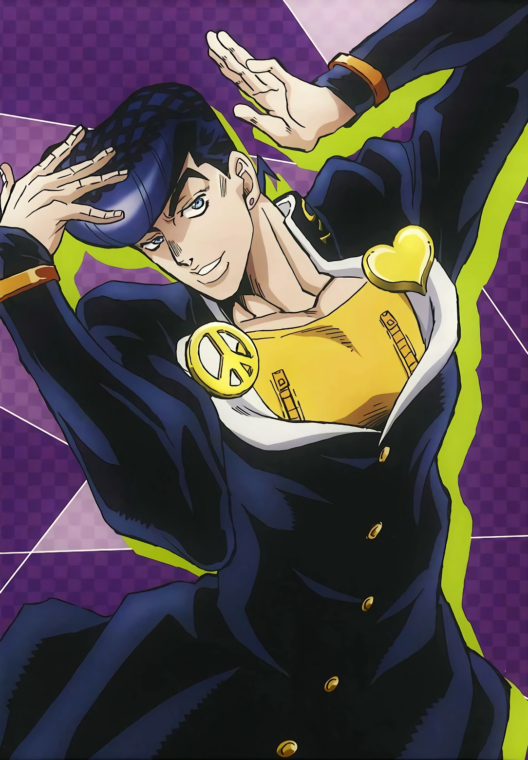
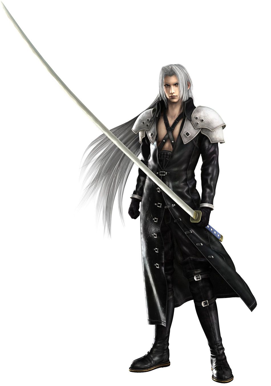
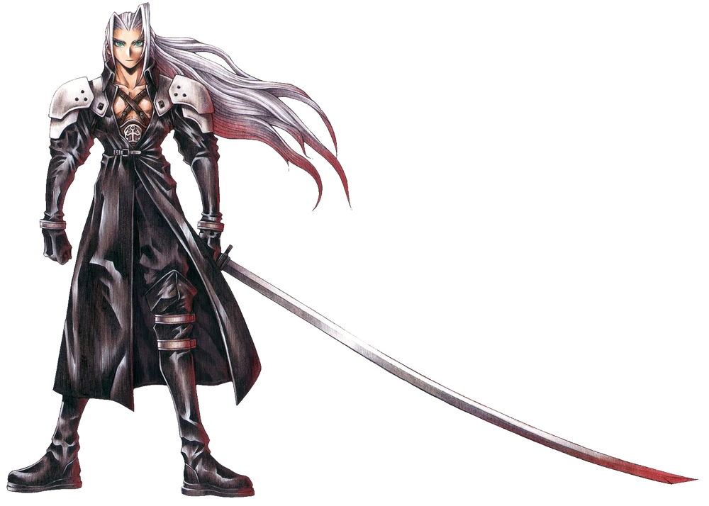